LaFantana
Platform arhitecture
and redesign
La Fantana is revamping their website and integrating an efficient e-commerce platform to provide a user-friendly experience and simplify the purchasing process for their hydration solutions.
Overview
Company
LaFantana
Year
2023
Platform
Web
My Role
UI/UX Designer
Team
Product manager (from client), Project manager, 2 UI/UX Designers and 1 Copyrighter
About
The company
La Fantana is a Romanian company and is one of the national leaders in providing modern and smart hydration solutions. They offer clean and quality drinking water for both commercial (companies) and residential (households) purposes.
Corporate website and e-commerce platform
The main website was mainly used to showcase some of their products with a basic description and a form to collect customer information for follow-up by the sales team. It also had a separated e-commerce platform where customers could order some of their individual products or sign up for bottled water delivery subscriptions.
The challenges
Harmonizing LaFantana's Digital Story:
Problem: LaFatana was operating two separate websites: one for business presentation and another for e-commerce, featuring only a partial product range. This separation leads to inefficiency and client confusion.
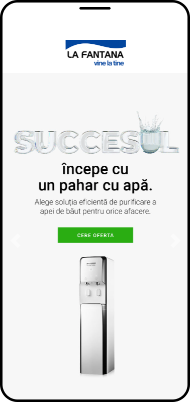
Elevating LaFantana's Online Presence
Problem: The existing LaFantana website, although functional, no longer aligns with the company's dynamic growth and success. There is a need for a website transformation to accurately represent the company's vibrant evolution and achievements.
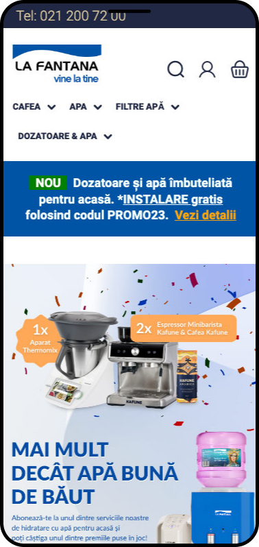
Goals
Company objective
Adapt the La Fantana brand to the evolving market demands and strategic shifts, resulting in a business setup with two distinct platforms for B2B and B2C clients, aligning the company with current market requirements.
Project goals
Integration of Platforms: Unify the two separate platforms into a single, modern, and user-friendly website.
Alignment with Market Requirements: Ensure La Fantana's business setup aligns seamlessly with current market demands and strategic objectives.
Platform Upgrade: Upgrade both B2B and B2C platforms to meet modern standards and enhance user experience.
Users
B2B Clients
Seeking efficient B2B solutions for water dispensing and related services.
B2C Customers
Looking for a user-friendly platform to order and manage water deliveries subscriptions for personal use.
The solutions
Information arhitecture (IA)
In crafting the information architecture, I cataloged and organized all existing pages and devised initial sitemaps for both websites.
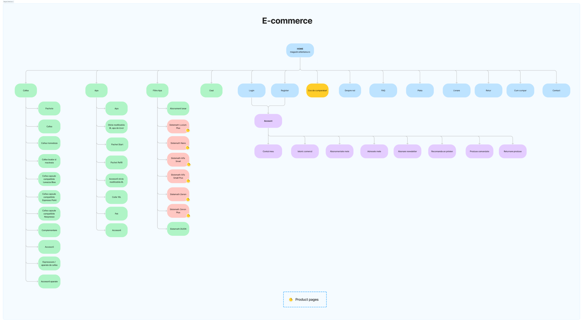

Following the removal of duplicated sections, we retained essential pages and conducted a card sorting session to determine the optimal grouping for products and pages.
The outcome of this session, refined in collaboration with the client to align with company objectives, led to the creation of the final website sitemap architecture.
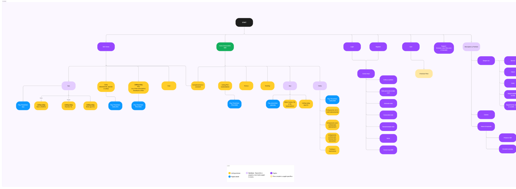
Structural Outlines
After talking with the development team and the client, we decided to keep the same flow as in the e-commerce. In research faze we fount out that almost all users ar split in 2 categories:
- Returning users that have a subscription and want to adjust it or renew it
- New users that search and view the products details.


Visual Crafting
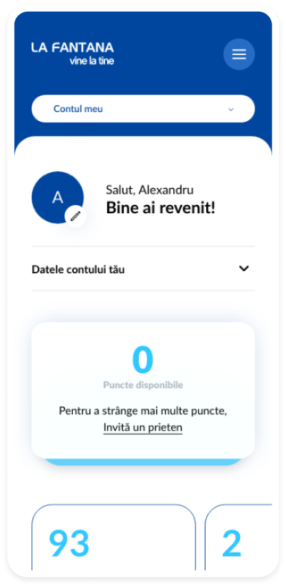
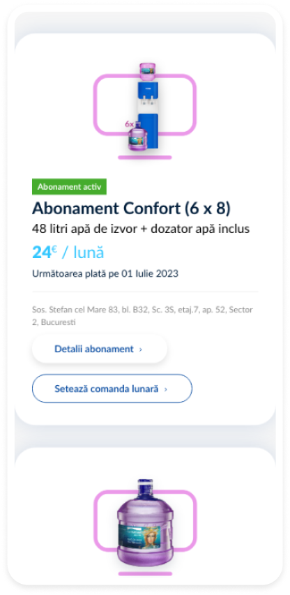
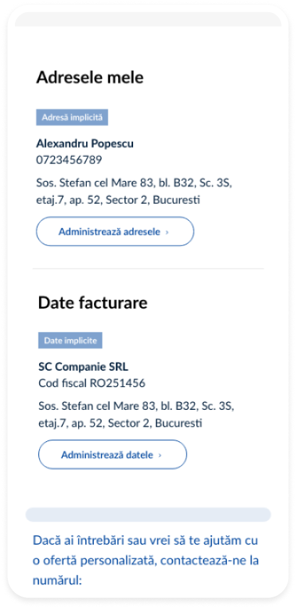
During the design phase, I worked together with another designer. My primary focus included the development of several key sections, namely: “My Account”, “My Subscriptions”, and the “Subscription Configurator”. Additionally, I contributed to the design of the checkout process and various other pages, such as the “login page”, “locations map”, and the “help and support” section.
Our vision for the website design was to emphasise the visual appeal of the products. We opted for a minimalist design, focusing on the products. To create visual dynamics and highlight the products, we incorporated various coloured shapes. We chose a color palette that closely matches the brand's color saturation.
To accentuate certain sections or areas, we also introduced elevation by adding shadows that reflect the height and depth of those elements and sections.
My Subscriptions - Active subscription
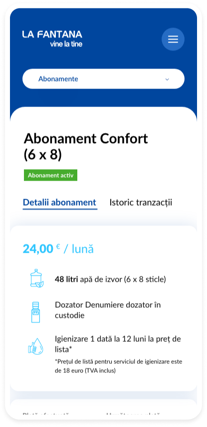
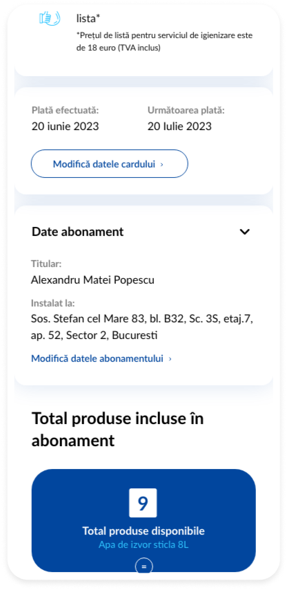
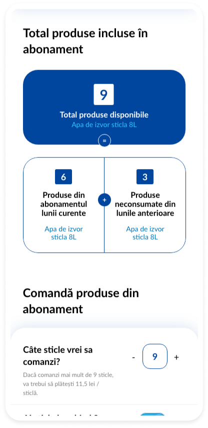
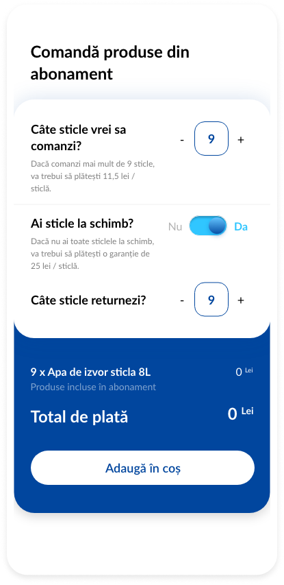
My Subscriptions - Active subscription
Design System
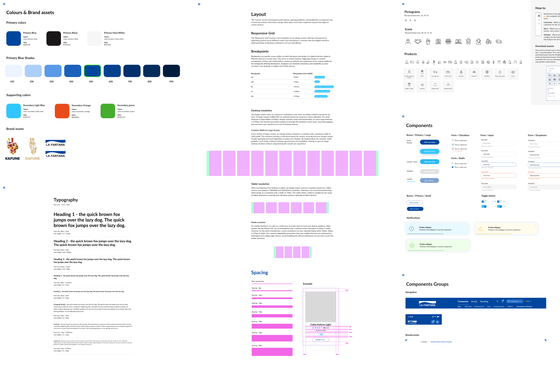
For the design system I chose the Atomic Design methodology for its ability to create a consistent and scalable user interface. This approach breaks down the design into basic elements, allowing for easier updates and a more intuitive user experience. It enhances collaboration between designers and developers, ensuring a cohesive look across the website and making the design process more efficient and adaptable to future changes.
